HOWTO: Design a logo on Twitter
ryancordell
Ryan Cordell
If there are any Latinists on twitter tonight, I need a Latin version of the DH slogan, "More Hack, Less Yack"...
ryancordell
Ryan Cordell
After too much time in VectorDesigner this weekend, I emerged w/a new logo for @thatcamplac: what do you think? http://twitpic.com/4jn3p9
via TwitPic
rkammann
Rudolf Ammann
@ryancordell @thatcamplac far too detailed, esp. to print on fabric: remove pointer, laptop and floppy disk. "LAC" aspect ratio distorted.
ryancordell
Ryan Cordell
@rkammann that makes sense-but this version seems dull-makes me a little sad to cut the pointer esp. #thatcamp http://twitpic.com/4jne9w
via TwitPic
rkammann
Rudolf Ammann
@ryancordell Drop the seal, then, and hang on to (a simplified) pointer? That'd be witty because the pointer says "that".
ryancordell
Ryan Cordell
@rkammann seal may be more important than the pointer-other suggestions for integrating traditional & tech?
rkammann
Rudolf Ammann
@ryancordell hang on to seal, drop the laurels, put LAC on circumscription, put the pointer in the centre, maybe inside a heraldic shield?
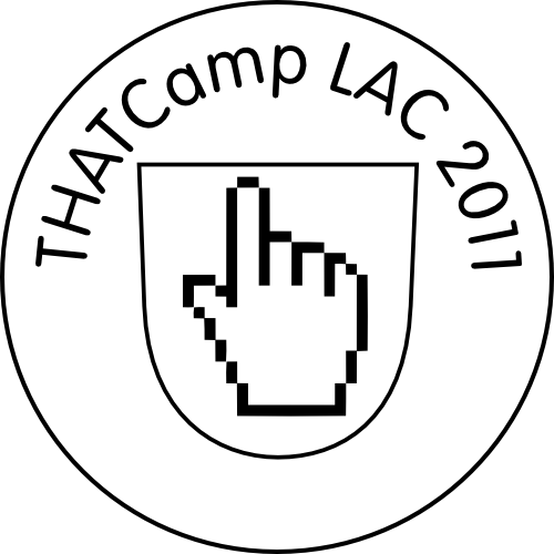
rkammann
Rudolf Ammann
via Flickr
rkammann
Rudolf Ammann
Remix #2 of @thatcamplac logo by @ryancordell http://is.gd/lhlcOH -- repost remix #1 http://is.gd/h1o56J #thatcamp
via Flickr
ryancordell
Ryan Cordell
Opinions? RT @rkammann: Remix #2 of @thatcamplac logo by @ryancordell http://is.gd/lhlcOH -- repost remix #1 http://is.gd/h1o56J #thatcamp
briancroxall
Brian Croxall
ryancordell
Ryan Cordell
@briancroxall @rkammann I actually worry that the QR code would worry many of our participants (not in the DH know): barcode = corporate
briancroxall
Brian Croxall
@ryancordell @rkammann That's why I didn't like the barcode. It makes you seem manufactured rather than creative.
thatcamplac
THATCamp LAC
Thanks to @rkammann for this amazing (transatlantic) #THATCamp LAC logo-don't you want this tshirt? http://plixi.com/p/91960013
via Plixi
aristotle_julep
julie platt
@thatcamplac @rkammann I really like this image. It reminds me of the seal of my alma mater, a small LAC. Great visual rhetoric!
